
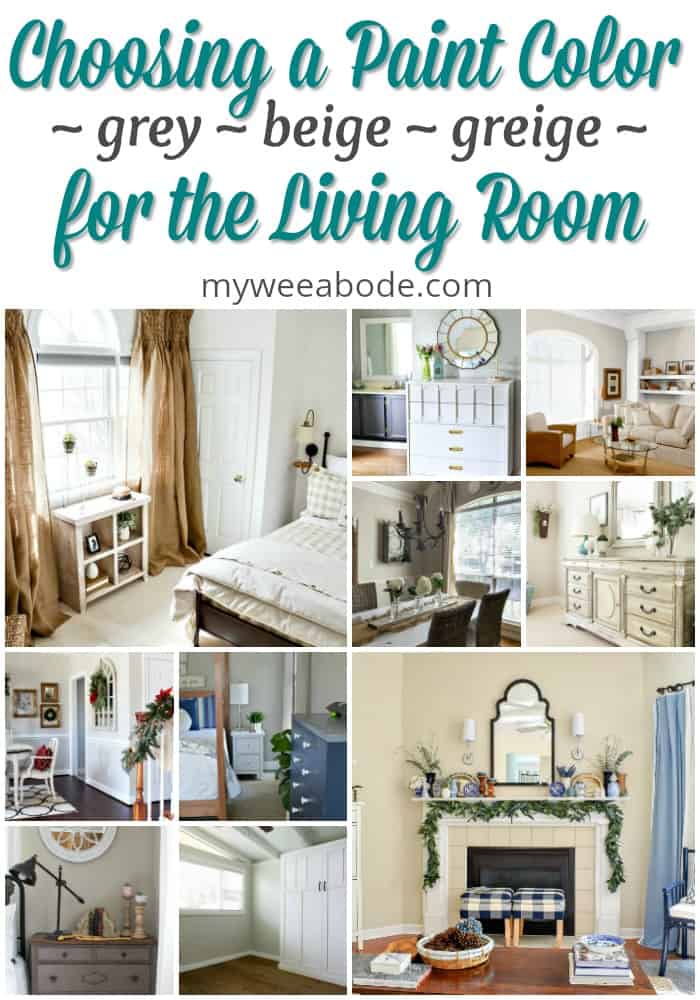
Help Me Choose a Living Room Paint Color
My Wee Abode will be taking part in the HomeRight Refresh Your Walls Today Contest! I’m asking my wonderful readers to help me choose a living room paint color!
Happy weekend, everyone (even though it’s now almost over)! I’m so glad you dropped in today, and I just want to say THANK YOU to y’all for taking part in this wonderful adventure of blogging! You all make this blogging gig a lot of fun! And, without you, there wouldn’t be a MWA (well, at least the blog part)! 😉
This post may contain affiliate links, at no additional cost to you.
For more information, see my complete disclosure HERE.
Want to hear some fun (and exciting-to-me) news?! HomeRight (makers of the HomeRight Super Finish Max Paint Sprayer, EZ-Twist Paint Stick, and more!) is sponsoring the HomeRight Refresh Your Walls Today Contest, and My Wee Abode will be taking part! Woot-woot!
HELP ME CHOOSE A LIVING ROOM PAINT COLOR
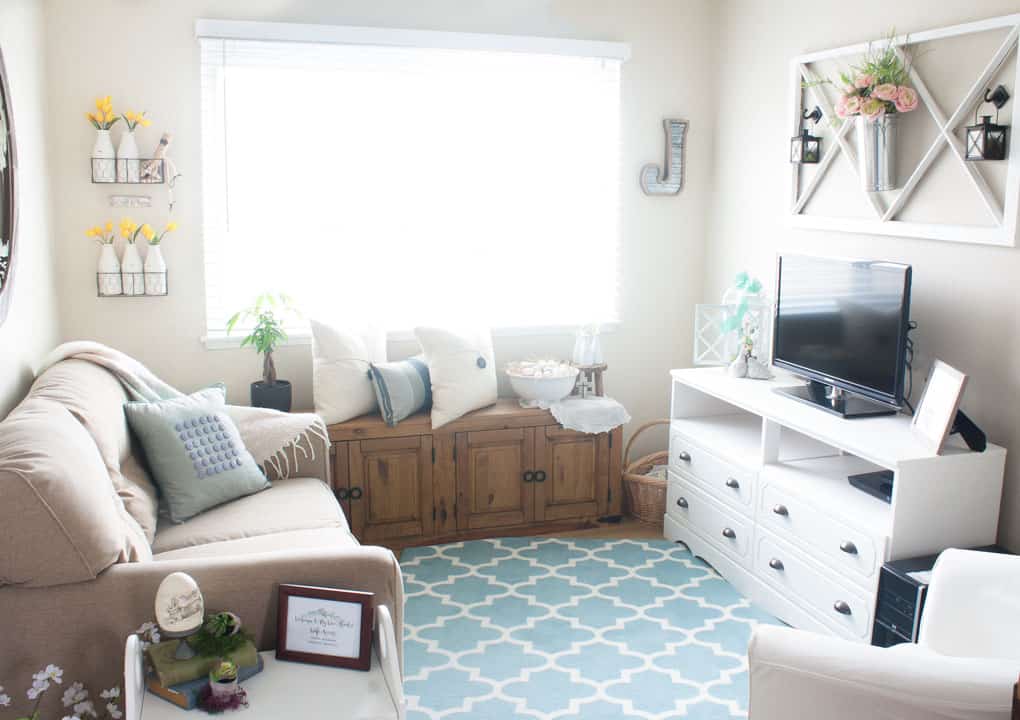
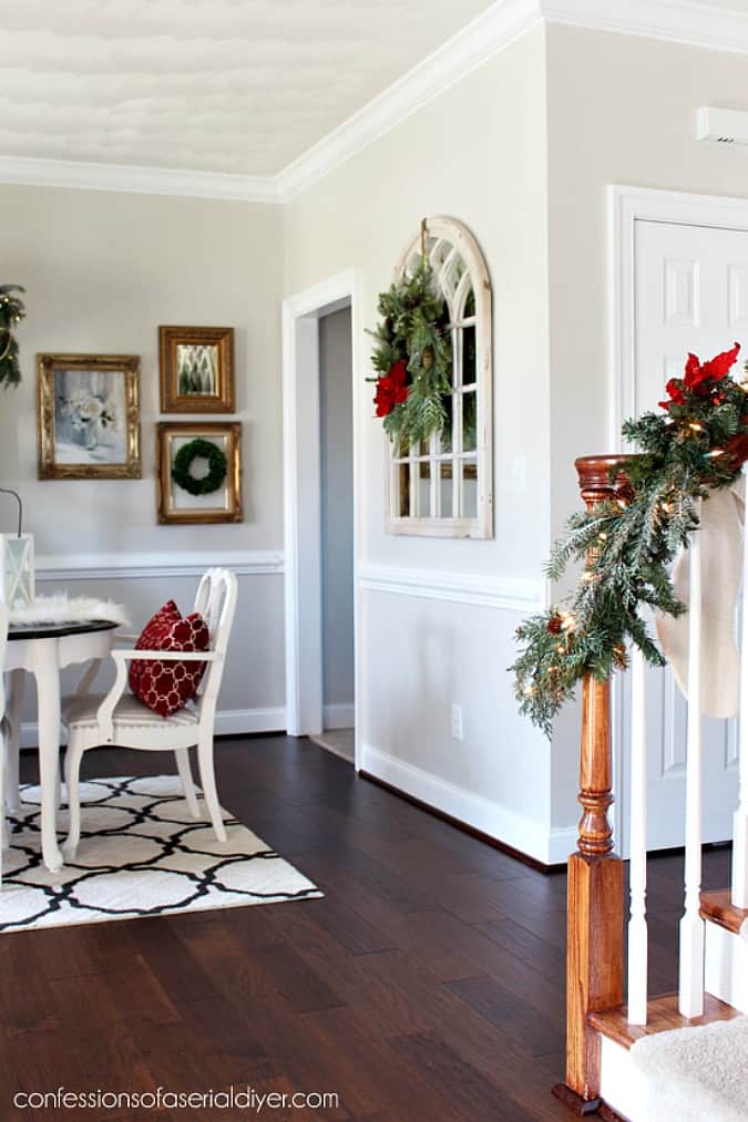
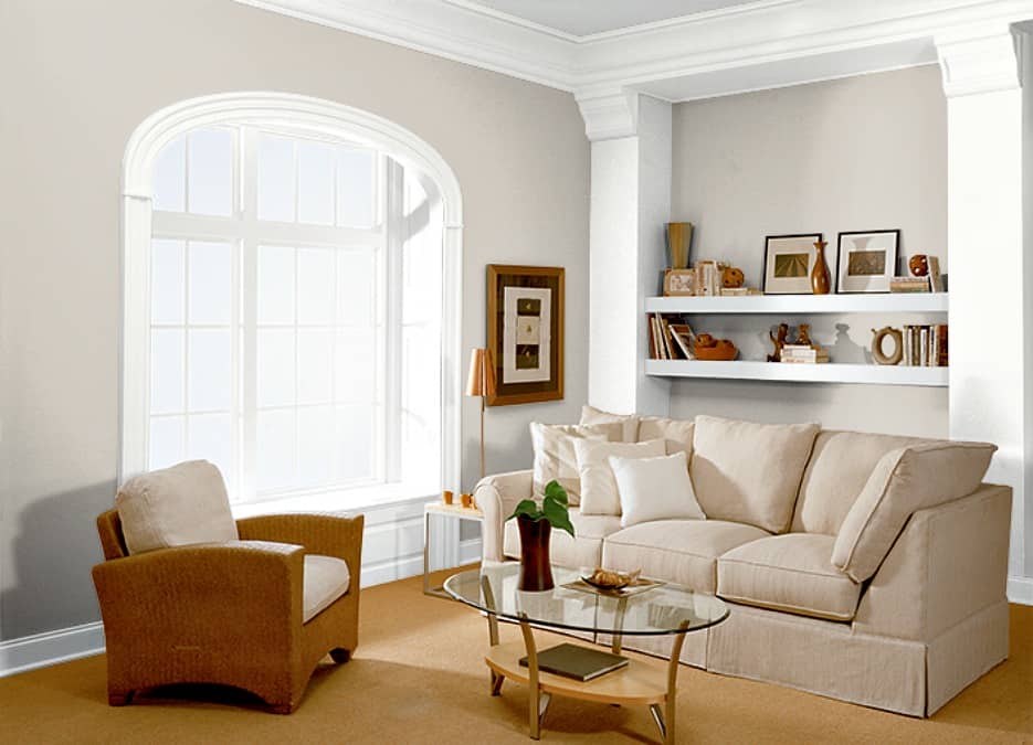
First things first! If y’all are up for the challenge, I would love to get your opinion and help in choosing the color that will be used to refresh the walls in My Wee Abode’s living room! First, here’s a pic of my current living room color… it actually looks a bit better in this photo than it actually is. AND you can also get a peek at my sofa color and a tiny-tiny bit of the carpet color (next to the basket on the floor).
Now, let’s take a look at the issues.
Issue #1 – Pink Walls?
When painting a room, whether a living room or bathroom, take into consideration the undertone of the color. Does it lean to cool colors or warm? Pink or gold? Choosing several colors you love, then painting samples on large pieces of white poster board or foam board, is a great idea. Set them against the walls, next to furniture/carpet, and in different areas of the room. Then, see how the paint looks, or reacts, at different times of the day. This will save a whole lot of ‘heart-ache’ when you paint the entire room!
When I moved into MWA, I thought the color of the walls was quite nice. However, the more I sat in the rooms, and then tried to photograph the rooms, the more I realized that the paint color had just a wee bit too much of a pink undertone for me. The walls actually look like the Mary Kay pan-cake makeup of days-gone-by (Google-it, friends)! 😉 This was most visible at night while sitting and blogging. Kinda depressing, and really not good for photo editing. Y’all, I REALLY don’t want pink walls!
You can see my spring home tour, and the wall color> HERE!
Issue #2 – Rental Walls
As you know, My Wee Abode is a rental loft apartment. When painting walls in a rental home, keeping the color a tone that both the renter and the landlord will be happy with is key. If a bright paint color is used, the walls will need to be repainted upon moving out. That’s extra work that most of us don’t want to do.
Another issue with rental walls… spending a lot of money is not needed (which would happen if re-painting needs to be done at move out, or if a paint is used that requires two coats). However, making the room LOOK like a million bucks is a nice goal, right?
Issue #3 – Walls with a Purpose
Another issue to take into consideration is what will be happening in the room you are painting. A kitchen may have white or off-white walls, while a dining room may need to have some warmth in the paint color, or a playroom may need something more bright and cheery.
As I mentioned above, when I started trying to photograph My Wee Abode, the color of the walls, and the reflection of the light on the walls, made it difficult to photograph. The new paint color will need to photograph well in bright light, as well as more ‘shadowed’ areas. “Shadowed” is new-blogger talk for “those areas that I’m still learning to photograph”. Hehe.
Issue #4 – “Decor Style” Walls
When painting a home, take into consideration the decor style of your home, as well as the color of large pieces of furniture in the rooms. Replacing a sofa, love seat, or carpet is not, necessarily, an option. So be sure that the paint color compliments the items that are staying in the room.
My Wee Abode has a coastal/farmhouse/cottage style. The sofa/love seat in the living room is a taupe-y sand color that looks great with just about any undertone… even pink (ugh)! However, the carpet is a gold color (again, not the choice I would make). Neither of these items is going anywhere (at least for a while). Sticking to a color that will compliment both the sofa and the carpet, yet stay true to the light and airy décor style is a must!
List of Must-Haves
So, with all that said, I think this is what’s needed:
- Keep away from the pink undertone, a greige (grey/beige) paint with a warm undertone that leans towards a gold/brown. This will make my landlord happy, too.
- In order to keep costs down, a paint that can be done in one coat. The walls in MWA are already painted in Swiss Coffee, which will make it easy to cover in a greige colored paint. I should only need one gallon.
- A paint color that is just a bit darker than a ‘white’ will be best in the living room. The natural light is very bright in the living room, so using a paint that is just a bit darker than a white will help with the light reflection, yet still photograph well in shadows.
- Using a color that is just a bit darker than white, and has the gold/brown undertones, but is still a grey color will complement the coastal/farmhouse/cottage décor and style in My Wee Abode.
Some of My Faves
Here are some examples from my blogger friends of some beautiful colors and brands. Let me know what you think…
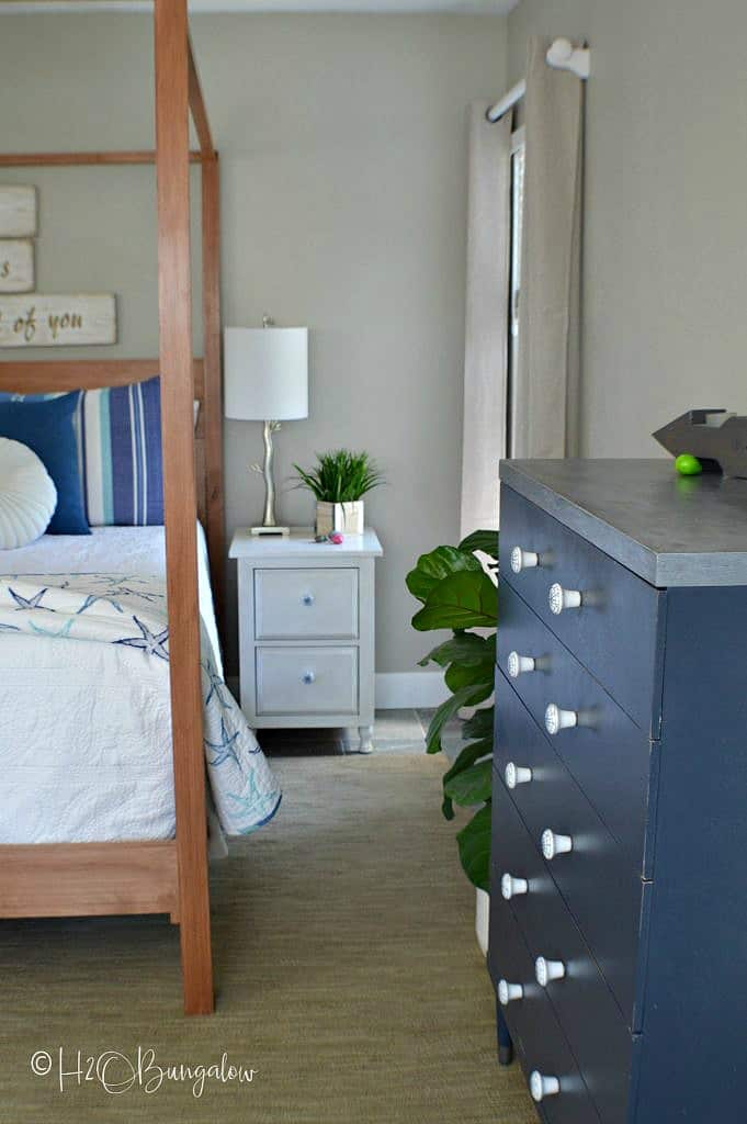
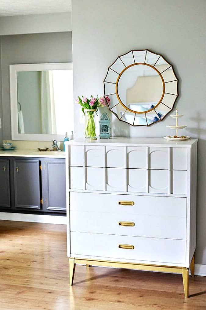
H2O Bungalow has a similar style and ‘color-love’ that I do. And, we both live in small homes! Take a look at Wendi’s whole bedroom reveal, which includes her brand/color: Benjamin Moore Revere Pewter.
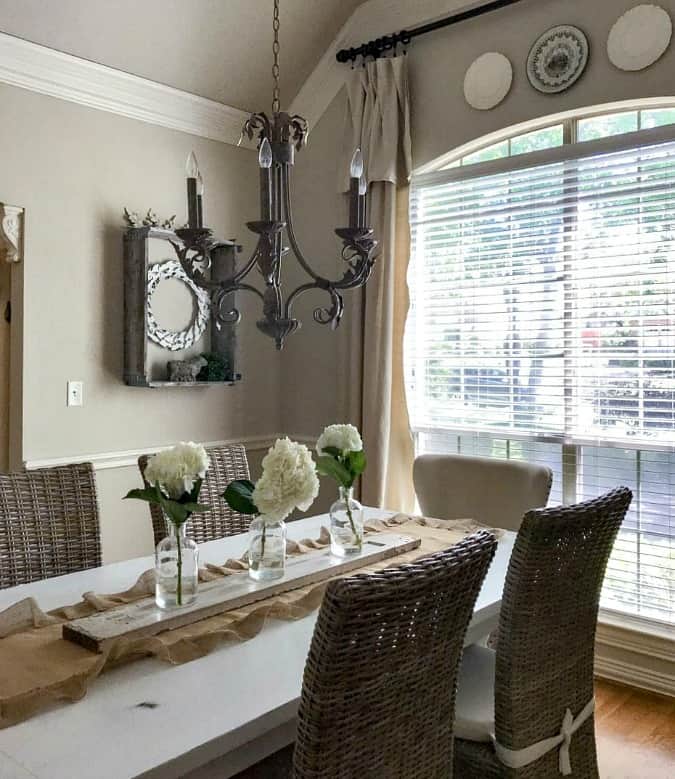
Cindy at County Road 407 did a dining room makeover with a beautiful neutral greige, Sherwin Williams Accessible Beige, to be exact. I love this color!
Girl Just DIY did a beautiful office makeover! Toni has actually painted most of her home in Sherwin Williams Repose Gray, and the office was one of the last rooms to get this paint update! Side note…Check out that beautiful trim on her cupboards!
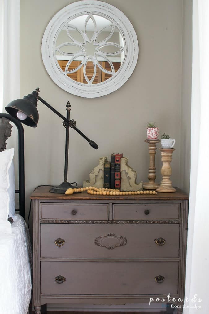
Post Cards from the Ridge used Benjamin Moore’s Smokey Taupe in her modern farmhouse bedroom makeover. I love how it compliments both the warm and cool tones in Angie’s bedroom.
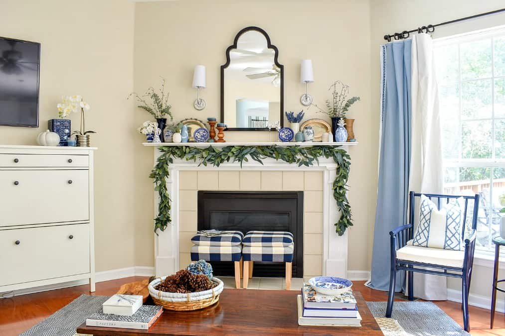
T. Moore Home recently updated their living room, and I fell in love with the wall color. I asked Teri what color she had used, and she let me know it was Sherwin Williams Maison Blanche. This definitely leans more beige than gray (at least on my monitor)! What does it look like to you?
Stonegable is one of my very fave homes and décor style, and has really helped me in discovering my own style! Yvonne’s home is painted throughout in Benjamin Moore’s Sonnet. Such a lovely white, with just a bit of warmth!
I love Christy’s style AND the colors in her home. Last year, she moved into a new home and decided to use Behr’s Campfire Ash throughout her bottom floor. Not only do I love Behr paint (it’s my go-to), but I love how the Campfire Ash adds the perfect ‘greige’ to Christy’s coastal/cottage style at Confessions of a Serial DIYer.
Abby at Just a Girl and Her Blog has a fave Behr paint color, too! Behr’s Silver City is used in many of her beautiful rooms and looks great with the golden tone of her floors in this photo.
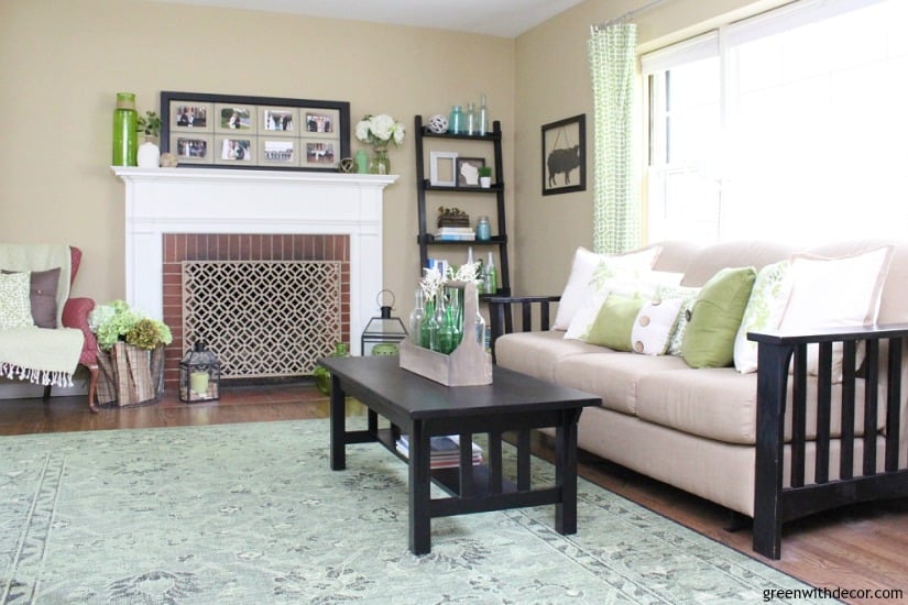
Green with Decor enjoys using tan colored paints in her home(s). This living room is from Meg’s “Favorite Tan Colors” post and features the living room of the home she moved out of, and recently moved back into! She really loves Sherwin Williams Camelback.
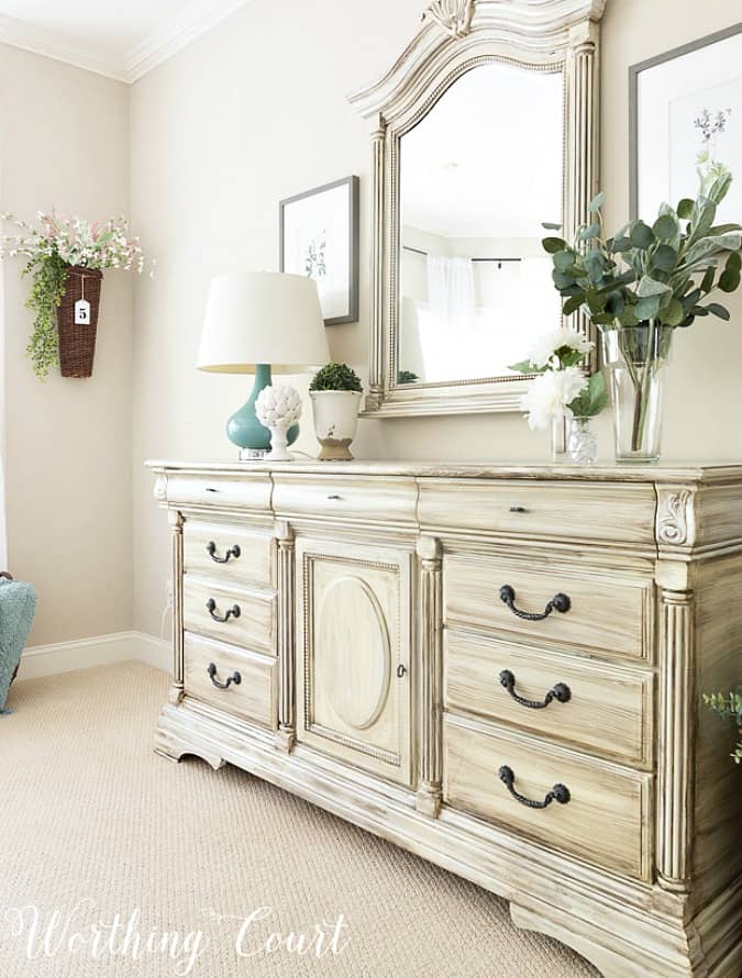
And last, but certainly not least, Suzy at Worthing Court was one of the first bloggers I started following. I’ve always loved the grays she uses in her home, and I especially love the color of her recent guest room makeover! See how the light is hitting on the right, and the left is more in the ‘shadow’. Both sides look great! Oh, the color? Sherwin Williams Accessible Beige. (Yep, the second time I’ve featured it…. hmmmm, I wonder if that means….)
Oh… I lied! I have one more… This is actually a ‘room’ that I created on Behr.com. Did you know you can ‘paint’ rooms on their app, and even upload a photo of your own room and paint it? Yep! However, this is NOT a photo of My Wee Abode, but I do like the color, Toasty Beige. I think this photo gives off more of the gray than the beige that it actually is. This is one of my fave Behr colors, though I have yet to use it! What do you think?
So… what are your thoughts? I love ALL these colors! Which do you like best? Do you have a color you think I should take a look at that isn’t listed here? Should I go with a known-to-cover paint that will cost a wee bit more, but truly covers in one coat? What brand is your fave? Leave it in the comments below… the brand and the name, and help me choose a living room paint color! I truly value your opinion, and would love to hear what y’all think!


Thanks for featuring my bedroom….it’s fun and hair pulling at the same time to pick colors. I love some of these ones you featured. How exciting to partner with a great company.
Thanks for letting me feature you, Wendi! It is totally crazy trying to pick out a color… SO MANY TO CHOOSE FROM! I’m very excited about working with HomeRight, too! They are wonderful, as you well know! 😉 Hugs!
I like the second photo’s paint and your choice on the last photo. Hard to imagine with gold carpet though. Not a fan of grey.. Love your living room. Makes your place look much bigger. We are going to love whatever you choose.
Aw, thanks, Myrna! Sometimes, it’s hard to actually ‘see’ the colors on our monitors, because we all have different color views. The colors on my TV monitor look totally different than on my phone, ya know? But, just like I said, I will def be getting the samples and placing them near the carpet and the sofa. 😉 (The Toasty Gray actually looks really nice next to the carpet… I had a paint chip of it. It’s definitely a warm greige. hehe) Thanks for your thoughts! Hugs!
The last two would be my choice. Behr Toasty Beige is my choice for you. You like this brand. This is a beige but has a gray look to it. Can’t go wrong with that choice. Good Luck.
Hi, Mary! Thanks for you input… I like the way you think, too! 😉 Stay tuned for the verdict! 😉 Hugs and hearts!
Hi! Good luck with your paint project! I have to pick a paint color, too – I’m participating in the contest and am painting my daughters’ bathroom! I really like the pewter, but the Toasty Beige looks great in your space, too.
Can’t wait to see what you do, Lauren! I’m looking forward to doing the post, and using the HomeRight product!
Wow so many great colors to choose from! I love that last color in the room you created. When I bought my house I bought a few samples and painted them on white foam core then carry them throughout my house to see how it looked in different lights. The one I thought I loved ended up being too green. Good luck with your choice… I know your room will turn out beautifully no matter what! XO
Thanks, Christy, for letting me feature your dining room. Campfire Ash is a def fave of mine, however, when I put the Toasty Gray on my wall and sofa, it was like the angels started singing! LOL! But, I’m going to check a few, and see what happens. And I will definitely use your foam board technique. I tell everyone to do that now! 😉
I think you’ve hit a good choice. Our last house was a spec home and we were allowed to pick a color for the entire first floor. We chose a color called “Estate Griege” and I loved it. I don’t even think you can buy it anymore. So recently when we painted the kitchen I searched like you for a nice warm light color. I ended up with Sherwin Williams Popular Gray. It can be really challenging picking a paint color. I’ve always been amazed a how different a swatch looks depending on the lighting. Can’t wait to see your end result.
I’ll take a look at the Popular Gray, as well, Patti! Thanks for the referral. I’m excited to see what happens, too! 😉
Good luck on your search Julie. I just finished painting the dining and living rooms and it was such a relief to get rid of the old colors. Now it feels like a breath of fresh air in there.
Thanks, Mary…. SO MANY COLORS, and so few walls! 🙂 I’m looking forward to seeing what the samples look like, and choosing a color! Hugs and hearts!
Thank you Julie for loving my dining room so much you added it to your feature’s! You are going to have a really hard time choosing. There are so many beautiful colors. Good luck and great post!
Thanks, Cindy! I LOVE your dining room, and thank you for letting me feature it! We’ll see what happens! 😉
Since it is a rental property my leaning would be towards that Behr Silver City grey color. Seems a good neutral not too dark or light. Hope this helps!
Thanks, Deborah! Great thought! KariAnne from Thistlewood Farms always says to pick your fave color, and then go one shade darker on the chip sample. Interesting, huh? It’s scary to me, but KariAnne’s wall colors always look amazing! Thanks for the input! Hugs!
Oh so many great choices! I lean more towards the tan/beige colors than the grays. That’s the rebel i n me. haha I can’t wait to see what you do.
🙂 gwingal
Nikki, I think I may have to go more towards the beige/greige. I’m just going to have to me careful of that Mary Kay foundation color! 😉 Hugs!
Hi Julie,
I love Sherwin Williams Agreeable gray and use it throughout my home. I know it isn’t one of your choices, but no matter what you choose…a fresh coat of paint lifts one’s spirits and you feel like you have a whole new room.
So good luck with your choices!
Have a great dat
Kari @# Me and My Captain
Thanks, Kari… I have heard Agreeable Gray is a definite ‘go-to’. Doesn’t Anita Joyce have that in her home? Thanks for the tip… I’ll look into it! Hugs!
There are so many colors to choose from today. I feel this is both a curse and a blessing. It’s slightly overwhelming. I don’t think you can go wrong with Repose Gray.
Allow me to throw Valspar’s Cream in My Coffee into the fray. I have it in my kitchen, office, and my guest room.
Good luck and I can’t wait to see your update.
Hmmm, first one to throw in Valspar. I have a store just down the street… I may drop in a check it out! Thanks, Lisa!
I had to laugh at the timing of this post. I’m looking at the painters (yes, they’re working this late.) painting my kitchen as I type this. I have Comfort Gray (SW) in there now, and I’m changing it to Alabaster (SW). It is what the majority of our house is painted and is my very favorite white ever. I have Mindful Gray (SW) in our office and Silver Strand (SW) in our guest room. Those are two you didn’t mention but may want to take a peek at. I also used foam boards when determining my paint colors – great minds think alike. 🙂 Well, friend, I hope you get it figured out. You have a great start with the colors you featured. I can’t wait to see which color you choose.
Thanks, Kim… I think I’m going to stop on the way home at the local SW and pick up some paint chips. I’ll be sure to get the ones you mentioned! Sounds like you are a SW lover! 😉
I like your idea about painting a big foam board and putting it on the walls! So smart as always. We have only painted once, our old condo to sell, and I was amazed at the difference in compass direction, light, etc. make! Pinning for when I must paint once again!
Thanks, dear heart, for the sweet words and the pin! I actually learned that foam board tip from Christy @ Confessions of a Serial DIYer (one of the features in this post). Christy is a smart one! 😉
Thanks for including my room in your color showcase. I will tell you that in certain light Repose Gray can cast a green tint and thus I have to use Color Correction. I really love the. Sonnett color and fissures paying my house white Berge settling on Repose Gray. I can’t wait to e what color you choose!
Oh, that’s good to know about the Repose Gray. By any chance, does that ‘certain light’ you are talking about include having trees outside the window? I know that natural colors outside the window can definitely cast weird tones. Thanks for letting me feature your home, Toni! Hugs!
I will be doing some room painting eventually and I appreciated your suggestion about painting on poster board to check color. Thanks for the great tip!
Absolutely, Teresa! You’ll want to get the tools I will be featuring, too! 😉 Hugs, dear friend!
I like Accessible Beige and Smokey Taupe. To me, some of the other beiges have too much yellow in them.
Thanks for your vote, Wendy! I agree… I def don’t want too much yellow, though it does need to compliment the gold carpet (it could be worse… it could be green!) 😉 Hugs and hearts!
Well maybe that’s it because we do have trees outside most of our windows.
I actually learned that from Yvonne at Stonegable. She had the same issue, and realized it was from the trees outside the window. 😉
Julie, we used Accessable Beige in our den/kitchen and in my bedroom. I love it! So neutral but warm and very relaxing!
Wow, such a popular color! Stopping at SW on the way home today! 😉 Thanks for your vote, Nancy! 😉
So much prettiness! I liked Accessible Beige a lot and also the Sonnet. Good luck making the final decision!!!
Thanks, Peg… Yes, that Accessible Beige is REALLY nice! Miss you!
I’m going to vote for Smokey Taupe! There was something warm about that tone that appealed to me. I think you’ll want to contrast a bit with your neutral sofa. I have so many samples from paint colors we’ve tried and tested before buying. That’s why I always have a few craft projects that involve using my inventory of leftover paint samples! Ha! Good luck!
Isn’t that a beautiful color?! I got three samples last night, and found I had the fourth at home (it was the one I was vacillating on getting a sample). So, now I have four! I hope that will be enough! 😉 Hugs, dear friend!
Wow – you have a lot of great color options to choose from! This is a toughy! Thank you for including my room in your roundup. Just fyi – Accessible Beige was a compromise between my hubs and I. I wanted gray – he wanted beige. So – long story short, Accessible Beige has very slightly gray undertones, so it was the perfect choice for both of us! I haven’t regretted using this color for a second – in fact, my entire house is painted with it.
Thanks for coming by, Suzy! Yes, Accessible Beige is VERY close to the Toasty Gray from Behr… thus, probably why I’m drawn to it! I’m thinking, whatever color I choose, I will be doing the whole abode in it! 😉 Hugs, sweet friend!
Good luck Julie, there are some great choices on your list. I do love a good griege. Can’t wait to see what you choose
Thanks, Sonya… doing sample boards tonight! Getting excited! Hugs!
Paint is so hard for me! I really need to paint our kitchen/family room open plan and we should have done that BEFORE we redid the kitchen! Oops! But, the color in here now works OK for now. I LOVE the Sherwin Williams Accessible Beige color!!
Carrie
curlycraftymom.com
Hey, Carrie… I agree, choosing the paint color has not been easy! >.< But, I think I got it narrowed down today. Will see what it looks like in the morning! Looking forward to painting next weekend! Hugs!
I can’t wait to see what paint color you pick Julie. We need to repaint pretty much the whole house and I want to go a few shade lighter than what we have right now which is Devine White by SW.
Painting really brings new life to a room, that’s for sure! I’m going to check out Devine White… Trying to figure out how you would go a few shades lighter in any white! 😉 Have a blessed day, sweet friend!
Oh man, I love paint colors too much! My mom and I geek out together with our bags of paint chips. 😊 I even carry a collection around in my purse to look at when stopped at red lights. 🤪 I’m currently working on painting the dining room, living room, and hall in…Accessible Beige!! I just found it looked the best with our east facing rooms and oak floors. Turns into such a warm gray in our light conditions. Fun to see you loving that color too! 😊 Using SW Alabaster for the trim. Had just the right amount of yellow undertones to compliment the oak. Cannot wait to see your updates!! 😁
Oh my goodness! You DO love paint! You need to get a paint ‘fan’ to carry in your car! 😉 Accessible Beige is def a fave… and was ALMOST the color I went with. We shall soon see! 😉 Can’t wait to see you next month!
Julie, I will be painting soon; living room, family area, bathrooms. This was helpful to see the different, beige greige walls. When we moved to our current home the walls all were painted with a pink undertone. They really stood out and not in a good way!
Thanks for sharing your post at the Friday with Friends link party.
RR
Oh, I’m glad it was helpful, Rachelle… Yeah, what is it with the pink undertones?