
From Soft to Bold: 15 Sage Green Paint Picks for Gorgeous Kitchen Cabinets
From Soft to Bold: 15 Sage Green Paint Picks for Gorgeous Kitchen Cabinets: Let’s take a look at some fresh and lovely sage green cabinet paint colors perfect for your kitchen or bathroom!
From Soft to Bold: 15 Sage Green Paint Picks for Gorgeous Kitchen Cabinets
Since my DIY painted kitchen cabinets are FINALLY done, let’s take a look at some of the sage green cabinet paint colors that were considered in the final decision.
We’ve got light, medium, and dark sage colors with cool to warm undertones. Included are several brands that I’ve either used or researched, all of which have great results!
Is Sage a Good Color for Kitchen Cabinets?
When this question is asked via Google, there are ‘yays’ and ‘nays’.
So what’s your take on this?
My thoughts are, “you-do-you”!
If you like sage green (or any color for that matter) use sage green on your cabinets! If you are DIYing your sage green kitchen cabinets, and you don’t like the color… you can always paint them again! (It’s really not that hard, especially if you follow my tutorial on how to paint kitchen cabinets… coming soon!)
But here are five compelling reasons to consider for using a sage green paint color on your cabinets (whether kitchen or bathroom):
- Timeless Yet Trendy – Sage green strikes a perfect balance between classic and current, offering a fresh alternative to white or gray that still feels neutral and versatile, especially if you tone down the color.
- Brings Nature Indoors – This soft green hue evokes a calming, organic feel that connects your kitchen to the outdoors, making the space more relaxing and inviting.
- Green Loves Just About Any Style – Whether your kitchen leans modern, farmhouse, cottagecore, or traditional, sage green tones work well with a variety of aesthetics.
- Enhances Light and Mood – Lighter sage tones reflect natural light and make a space feel airy, while deeper shades create cozy warmth without feeling too dark.
- Compliments a Wide Color Palette – Sage green pairs well with wood tones, brass or matte black hardware, white countertops, and even bold accent colors like terracotta or fuchsia.
all the freebies!
BECOME A VIP!
Get instant access to the My Wee Abode FREE Printables Library!
Fresh and Lovely Sage Green Cabinet Paint Colors
So let’s cover the colors from light, medium, and dark.
Remember, these are all sage colors, with cool or warm tones, and undertones of yellow, blue, green, and gray,
Plus, I’ve included LOTS of photos (one for each color), mostly in kitchens.
AND, we mustn’t forget the all-important brand and name of the color (because simply having photos of sage kitchens really isn’t helpful, right?).
Also, I’m including some color palettes with coordinating colors and even some accent color suggestions you might want to use in a kitchen or bath with sage green cabinets.
Shall we get started?!
Light Sage Green Paint Colors and Brands Names (Pale Sage Green)
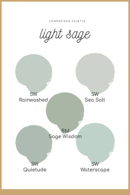
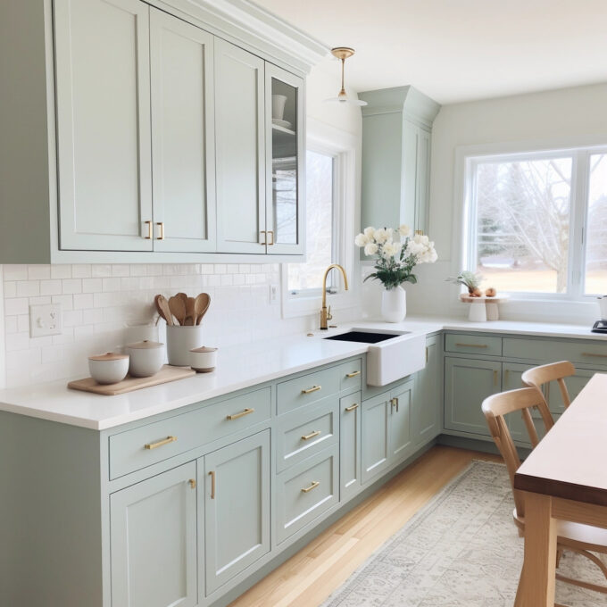
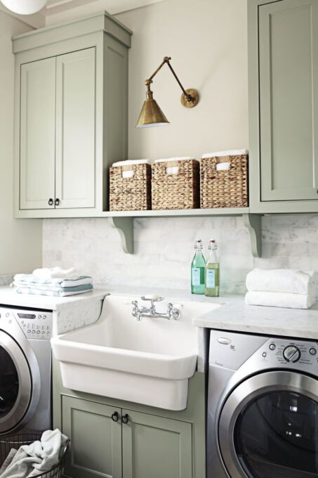
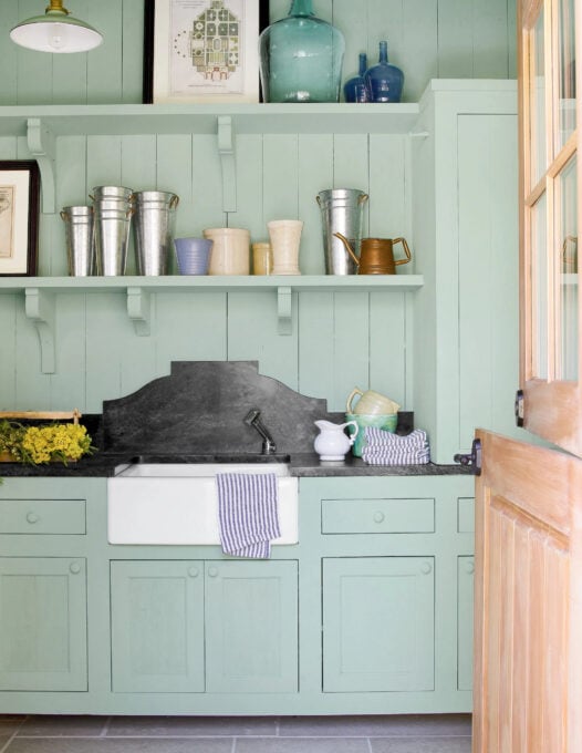
Rainwashed by Sherwin Williams (SW 6211)
Yes… this is the color I used on MY kitchen cabinets. However, because my kitchen is still in progress, I decided to share a photo of a completed kitchen in this cool, pale sage color.
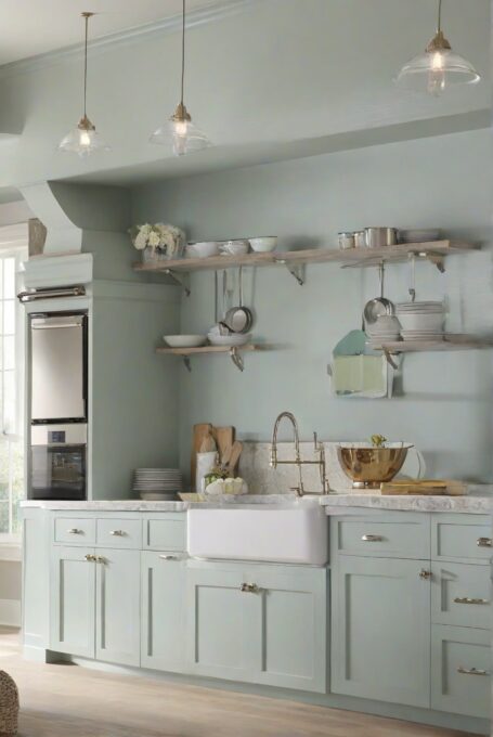
This light silvery sage has a blue undertone, but can also look gray in certain lighting. You’ll see more of how this works as I share more photos of the my kitchen. It reminds me of a succulent plant.
Coordinating colors can include:
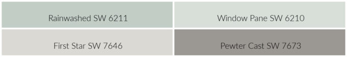
You could use accent colors such as peach, blush, or even a poppy orange! Try some burnished gold, too!
Sea Salt by Sherwin Williams (SW 6204)
Sea Salt is another cool sage color with blue undertones, but this time it is a bit more muted than Rainwashed.
As you can see, pale sage green looks great with gold accents and wood tones, even if the green has a cool undertone! Sage green is VERY flexible!
Here are some dramatic coordinating tones to bring out the gray color in Sea Salt:
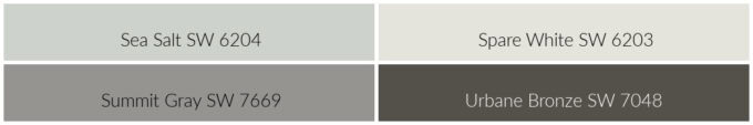
To add even more drama to the area, accent using some plums, roses, pale pinks, or even bright green!
Sage Wisdom by Benjamin Moore (CSP-775)
This light green paint can also read medium in depth of color, depending on your lighting. Many call this more of an “earthy” green, so you can definitely see more ‘greige’ in the undertones.
Want to see more of Sage Wisdom? Here’s a guide to using Sage Wisdom by Benjamin Moore in your home.
To accent this natural green color, think warm whites, and maybe even a deep muted plum:
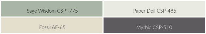
Add a pop of lavender or even a deep, dusty blue, and you’re all set!
Quietude by Sherwin Williams (SW 6212)
This light sage green was in the running with Rainwashed for my kitchen cabinets. And, go figure, Quietude is one shade darker than Rainwashed!
Quietude has a very coastal vibe and gives a calming effect to any room! Of course, the bathroom pictured below is found in a beautiful beach home on the water.
When choosing coordinating colors, Sherwin Williams suggests these:
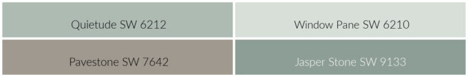
For pops of color, try some goldenrod tones and even a touch of teal.
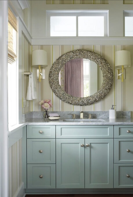
Waterscape by Sherwin Williams (SW 6470)
Sherwin Williams’ Waterscape is considered to be part of the blue family, but with a warm green undertone, which gives it a minty sage color to my eye.
This color pairs well with colors that have an orange undertone:
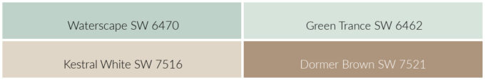
As you can see from the photo above, bright pinks, blues and purples look great with Waterscape!
Medium Sage Green Paint Colors and Brands Names
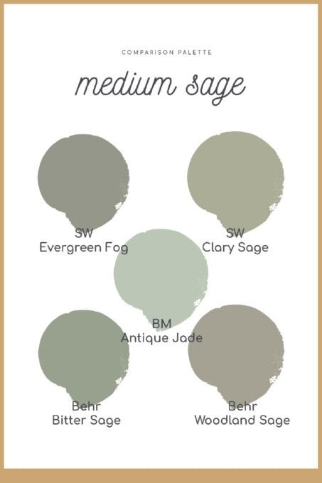
Evergreen Fog by Sherwin Williams (SW 9130)
Sherwin Williams considers Evergreen Fog a “gorgeous-green-meets-gray with a bit of blue”. This tone is definitely darker than the light colors described above, but still not completely saturated to a dark color. It feels very ‘natural’ to me, what about you?
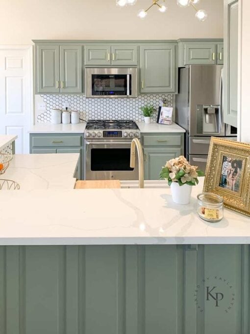
You can see by this photo that sage green colors take on certain looks and tones in different lighting (i.e., the cabinets in the background vs the island in the foreground). That’s why it’s important to test your color ideas in different areas of the room you are painting. More on how to do just that in an upcoming post.
Here are coordinating colors that you might use… note the natural, gold undertones of the two bottom colors, and the greenish gray of the Ethereal White.
You might want to add some deep mustard, rust, or even a muted peach for some extra color in the kitchen (think a vase with flowers, or even a cannister set).
Clary Sage by Sherwin Williams (SW 6178)
Can you tell I’m a bit partial to Sherwin Williams?
However, I’m breaking my cool undertones picks with the yellow undertone of the medium sage color of Clary Sage! Another ‘earthy’ green that is a bit more saturated.
Again, this photo shows how light affects color! It’s a bit crazy!
Here are some suggestions for coordinating colors you can use on the walls, trim, and even flooring:

Add some pale blue touches, or even a pop of pale bubblegum pink/lime for some color-fun!
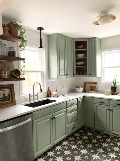
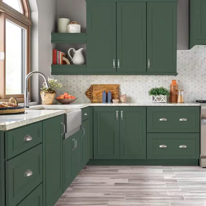
Antique Jade by Benjamin Moore (465)
Antique Jade is another gray-green that can look gray in certain lighting, and a medium sage in other lighting!
This photo, courtesy of Houzz.com, shows the light hitting part of the cabinets.
Here’s some coordinating colors that include a deep blue!
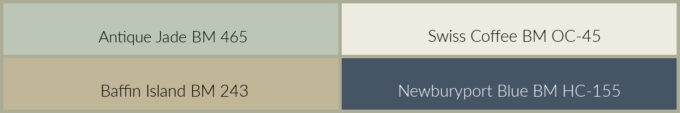
For a bit of color, add pops of pale muted blues and deep plums. And, of course, some deep orange with sage never hurts!
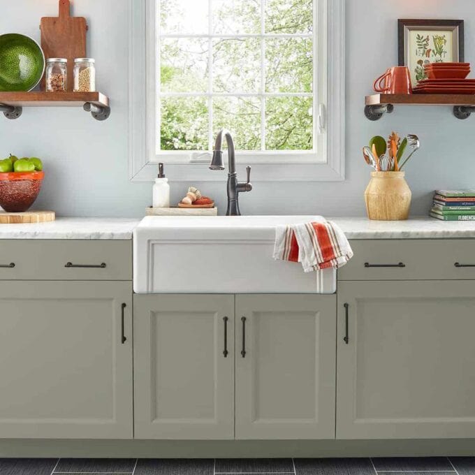
Bitter Sage by Behr N390-4
We’re switchin’ it up with brands and sharing the first color from Behr!
Bitter Sage is considered to have an olive undertone, which brings the outside into the home. (This is my favorite medium sage green.)
These coordinating colors are somewhat unexpected, but lovely! (Unwind is a very light sage color… almost white with green undertones.)

You can ground these colors with a touch of black, just like Haneen did in her kitchen, plus add a bit of apple red for a pop of color.
Woodland Sage by Behr (HDC-NT-01)
Here’s our first sage color that is considered to be in the gray family!
Woodland Sage by Behr is a muted, earthy-gray with a SLIGHT undertone of green. According to Behr, this color has a calming affect in any room.
I think your coordinating and accent colors would REALLY change the tone of these cabinets!

Since Woodland Sage is such a gray color, you can definitely add just about any splash of color you would like!
Dark Sage Green Paint Colors and Brands Names
Rosemary by Sherwin Williams (6187)
We’re back to Sherwin Williams and some drama!
Rosemary is a deep, organic green with a cool gray undertone. SW says this color is perfect for cabinets and furnishings!
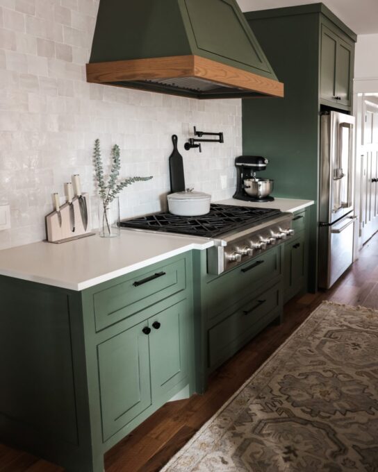
Black looks great with this color, as well as these coordinating colors suggested by Sherwin Williams (gotta love that deep, cool brown):
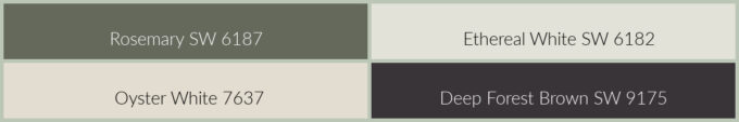
For color accents, add some rosy terracotta or peach, along with some navy or pale muted blue.
Vintage Vogue by Benjamin Moore (462)
Described as an ultra-dark, smokey green, Vintage Vogue can be used in place of brown or black.
Sarah, from Thrifty Decor Chick, created these shelves in her office all by her ‘lonesome’… and she did a GREAT job! She used Vintage Vogue because she fell in love with it when she used it on a tiny cabinet in her living area.
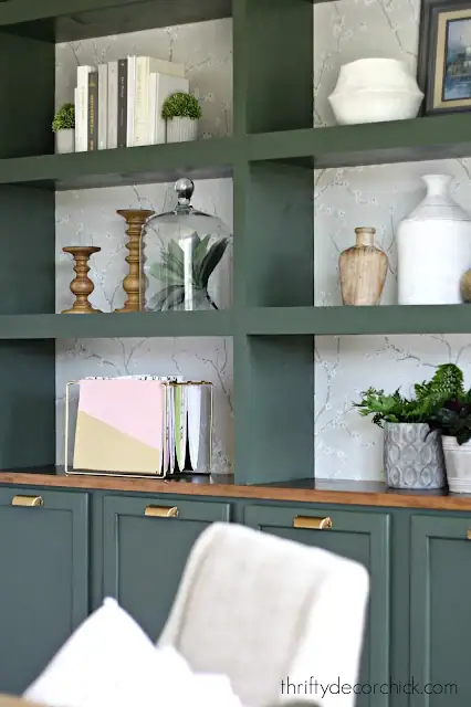
Here are some coordinating colors:

For a splash of color, add some burnished gold, black, and even some muted navy. So pretty!
Vine Leaf by Behr (N400-7)
Vine Leaf is a deep, garden-inspired green that is definitely a cooler color.
Though there are some warmer orange accents in this kitchen, the wall color is a cool gray that leans to lavender… and it looks great with the Vine Leaf!
It’s no wonder that one of the popular coordinating colors is a deep wine:

Adding touches of cool pinks and blues would look great with this color! And, of course, orange!
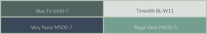
Blue Fir by Behr (S430-7)
The bluest of the dark sages in this post, Blue Fir is positively in the green color family, but can also come across as singin’-the-blues!
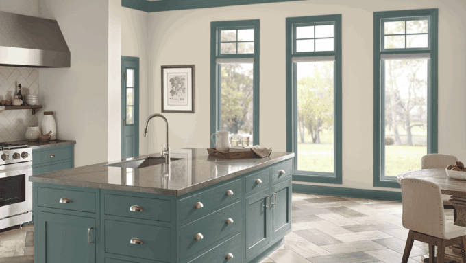
Of course, this cool, deep sage green is screaming for some cool coordinating colors!
You can add muted tones of rust (pale, medium, and dark), along with cooler colors that you find inviting!
Pewter Green by Sherwin Williams (SW 6208)
If I were going to go dark, I think this is the color I would choose!
Pewter Green is a dark, silvery green that is reminiscent of wood and metal. This shade would go with SO many different coordinating AND accent colors. So fun to work with!
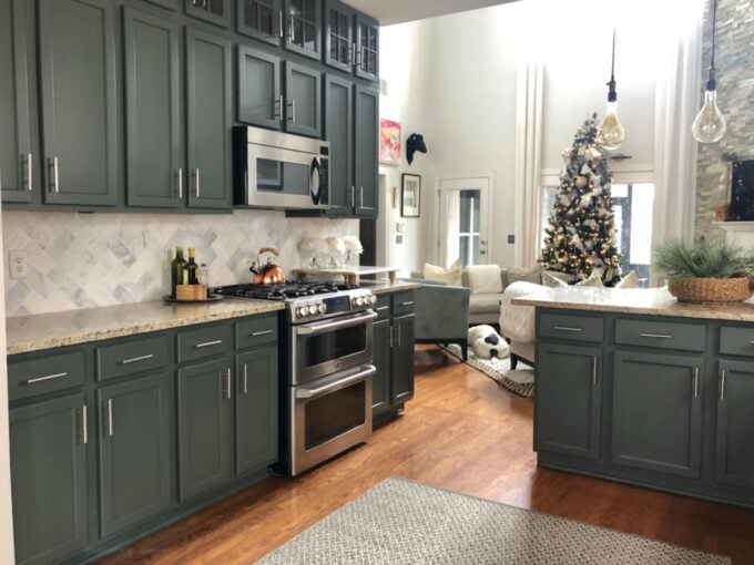
And I think I see some of these coordinating colors in the kitchen pictured above:

For a mid-century modern look, add some burnished gold, deep brown, and maybe even a touch of lilac!
So, there you have it! From Soft to Bold: 15 Sage Green Paint Picks for Gorgeous Kitchen Cabinets! What do you think?
Would you go pale, like I did with Rainwashed? Or would you go medium? Dark, like Pewter Green?
I would love to hear what your thoughts are on sage green kitchen cabinets, and what your favorite colors are in this post. Do you have any others that you love? Let me know!


So many great choices. I guess you need to figure which one feels good. I tend towards the lighter ones but everyone has their own “peace” sage. Enjoy the process and I can’t wait to see what lovely things you do. God bless
Thanks, Josee! Yes, it’s definitely a subjective choice!
I love the shelves in the Vintage sage just feels so sofisticated.
Yes, very elegant, Fernie!
I am unable to paint our cabinets at the moment, but you’ve given me some great ideas! I’d never heard of Mayonnaise, and hello, Swiss Coffee is dreamy! We painted our walls a dark green about a year ago and girl, let me say it made me like my kitchen again. The granite counters always look (to me) like cat puke. A little pink, brown, black specs, etc. Yuck. But with the walls being SW Privilege Green, it completely changed the look. I was so shocked. I mean, I knew paint could change a mood, but change the look of a countertop?! Wowza. Great post.
That is crazy that a coat of paint changed the look of the counters! What a blessing! Yeah… Mayonnaise is an interesting paint color name, right?
I love the color, would be interesting to see when done
Thank you for linking to SSPS 371. See you again Monday
Thanks, Esme!